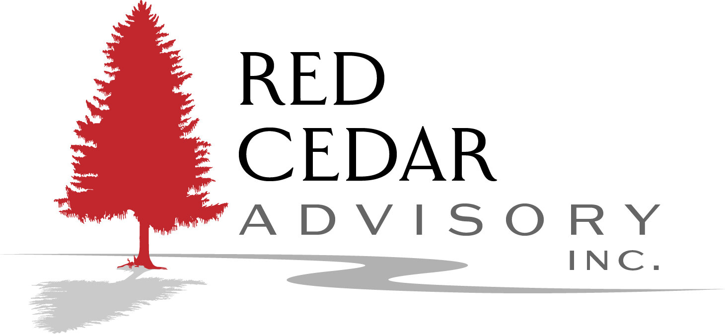
I was contracted to design a new logo for a local financial investment firm, located in our downtown area, next to the river. The company name is Red Cedar Advisory and wanted a look that demonstrated stability and longevity. I designed a handful of options for them with varying styles of treatments of cedar trees and rivers. After a few brainstorming and collaborative sessions, this is the logo they were most happy with.
The color red and tree were obvious elements and the addition of the river helped correlate their location plus, added a symbolic representation of power and progress, to add to the strength and longevity of a cedar tree.


